„Monochrome Bilder / monochrome pictures“ 1976 – 1990
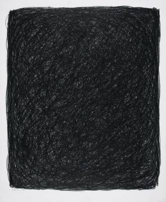 Ohne Titel, 1976
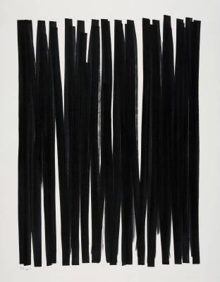 Ohne Titel, 1978
From 1976, Rolf Hans reduced his color vocabulary even further and gave expression to his pictorial thoughts only in monochrome areas. In addition, in the following two years he concentrates, above all in his works on paper, on the most intensive medium available to a painter: the achromatic color black, in which the state of utter calm manifests itself: "The silence, the silence in conversation make us rich because they do not need the speech. Probably the agreement, similar to the soliloquy, the oneness with nature, the understanding of love. You do not need the words."
There is no doubt that Hans' drawings are not dumb, as we can discover in the „Ohne Titel“ of 1976. In bold hatching here the oil pastels are applied, which are not opaque side by side and on top of each other. In this way, the smallest parts of dark gray to white shades, which look like silvery light effects. If we take a closer look, we will learn how the entire surface vibrates from the inside out.
We also find such highly subtle means in the felt-tip drawing „Ohne Titel" of 1978, which has an equally strong, but different kind of dynamic: broad, almost vertical lines cover the paper, which in some cases directly adjoin or overlap, so that always again the white of the painting ground emerges in narrow lanes. Upon prolonged consideration, this staccato of black and white begins to shift in front of our eyes. An accent is the narrow openwork color stripe near the center, which allows us a moment of rest. Works like these conjure up many relatives to informalize his early pictures.
But Hans always tries to tame the organically proliferating nature of his being and to reduce it to a minimum. This quest is reflected in a variety of ink drawings - series and single sheets - which are produced between 1976 and 1981. In them, Hans takes up a medium with which he had already occupied himself in the mid-1960s (see illustration opposite). Especially during his stays in Ticino ink is an important means of expression: "Holidays full of drawings / Luther read / nature as religion experienced.“
Hans has been attracted to the Centovalli since 1967, which has already given the Dadaists a strong creative atmosphere. And he too is inspired by the seclusion and unique beauty of the landscape with each visit. He works hard here "in nature after the head. "For him, that means not reproducing nature in a realistic way, but instead, according to its model, pictorially conveying the mathematical formula of the organic as the legitimacy of creation with its own instruments.
Possibly also the series with ink brush drawings „Ausschuß 1 - 5“ of 1978 develops during its holidays in the Tessin. As with the "Flächenbilder", the black color is applied in a translucent manner, whereby here too any hint of the manuscript is negated. Unlike those works, the monochrome surfaces are not bounded by any concluding contour, but only by narrow lines, which give them on the one hand a compositional support, on the other hand leave enough space to unfold freely; informally, they pull themselves together or spread out. In this way, we might think that the floating color surfaces would 'breathe'.
Not only in these, but also in the following pictures, Hans gropes to reality: "Again and again the old desire to see through nature, to understand parts of their whole and to represent them with their own means. [...] It is nature whose freedom and order, exuberance and sense of form, its own critique, strengthens its standards. It offers many variations, you just have to see them. "With this, nature serves him to free himself from the dominant control mechanisms and the objectivity of his artistic means in order to be a little closer to creation.
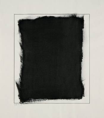 Ausschuss 1-5, 1978
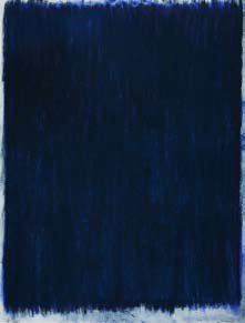 Sternenzelt, 1979
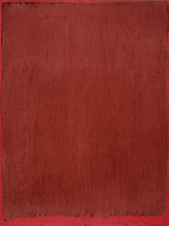 Auf kräftigem Rot, 1979
In the year in which Hans makes this episode of several Inks, he works again with pastel crayons. Along with this, he also changes his color spectrum: "Color noise in pure pigment. A grip on the palette of pastel crayons that died years ago is celebrating resurrection orgies. The reins fall. "This euphoria can be understood in " Sternenzelt ", 1979. Without any bordering or bordering, almost the entire leaf is covered with paint. By layering the more or less opaque paint jobs in the sequence of light to dark blue tones, Hans achieves not only a sublime movement within the surface, but also a tremendous luminosity of color.
This is also true for the sheet created at the same time „Auf kräftigem Rot, Tegna / Tessin", in which the sequence of the superimposed colors runs from dark to light nuances of the fundamental tone. The industrially colored red paper used as a base intensifies the subtle color effect. The integration of colored image carriers in the composition we find again and again in the pastels, such as. in the series "Tegna / Tessin" from 1982.
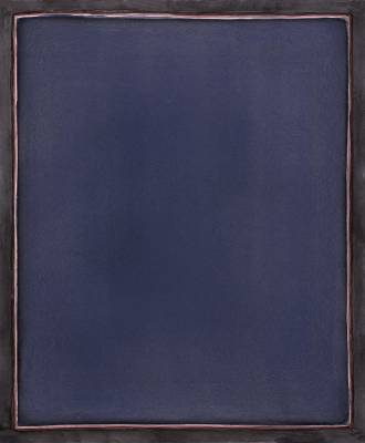
 Ohne Titel (Dezember 1980)
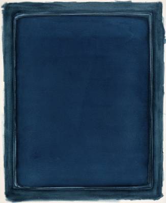
 Mai VI/2 - Dreimal Blau, 1981
In the works on paper from 1980 and 1981, Hans takes up the element of framing again. First of all, he grips the surface with a very fine line followed by a broad stripe in mostly graduated, darker tones, such as: For example, in the watercolor „Ohne Titel (December 1980)". The double framing makes us feel even more the gentle forward-striving of the greenish field, the rounded corners rather suggesting a forward-vaulting.
An increase of this dynamic we experience in the watercolor "Mai V / 2 - Dreimal Blau", 1981. Here are at the edges of the dominant, bright blue surface each have a narrow track of the two underlying layers of paint - in rosé and bright blue - to see. They are surrounded by a blue-black, which lends even more depth to the composition as the darkest part of the color. In this way, the two bright stripes form the dramatic moment of the drama: like an unending echo, they accompany the main actor and are the impulsive force that pushes him to us.
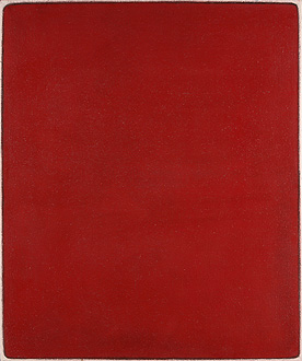
In contrast, the color fields in the subsequent pictures seem to hover unhindered above the ground, with the underlying colors shimmering at their edges sometimes more, sometimes less. Thus, in the painting „Farbsprache Rot II", 1983, the area extends to close to the edges of the picture, but not beyond it. Here, Hans first applies opaque white as a basis to the canvas, before he places the subsequent colors over it, so that overall a homogeneous image surface is created.
In other works such as „Spanisches Blau (Mancha)", 1983/84, he primed the canvas with a darker, transparent layer of paint, to which he then places partially grainy paint layers. As a result, the rough structure of the canvas at the edges of the image corresponds to the rough materiality of the blue color field. At the same time, the light refracting to the uneven surface adds an element of design that is incalculable, giving the composition additional liveliness.
 Farbsprache Rot II, 1983
 Spanisches Blau (Mancha), 1983/84
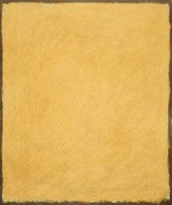
Hans enhances this vitality with his color choice. He finds inspiration for this during his journey through Spain in the late summer of 1983, where he is fascinated by the „Feste der Farben" under the southern sun: "[...] Green in human variations, / pale yellow, golden ocher, / shades of gray, warm , cold / flesh color against dark brown, / violet in light tones, / orange ocher to red, / reddish in differentiations to brown / the all-spanning blue. Bright colors of the day, / glowing, silent colors of the dawn, / dark tones in the transition to the night, / muted colors of the morning. Unlike the paintings like „Spanisches Blau (Mancha)", not the rough surface structure generates the moment of motion, but the gradations of the dominant color, as in the pastel „Ohne Titel (September 1986)". On a black ground, which partially shines through, the fine, light and dark shades of brown are applied in a delicate way. Their structure may be reminiscent of a dense cloud formation that threatens to announce a summer thunderstorm.
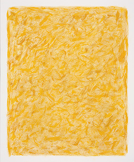
As with this sheet, the „Zeichnung Gelb“ of April 1986 also contributes to the dynamics of the composition. With short strokes of the brush, the tempera paints are set in a variety of shades from white-yellow to ocher on the leaf. In this way, after a short look, the entire surface begins to 'dance' right in front of our eyes. Yellow is the color of light. What bans Hans here on paper is the universal gleaming light of a warm spring day.
With the „monochromen Bildern" Rolf Hans finds his very own artistic formulation to tell us the world as he sees and experiences it. He feels the world in colors. And so color substance and color light are the basis of his painterly vocabulary. As an important element of composition, the color form - including black and white - is added, because only it allows to design something new. It is for him a measure, a means and an order in the transference from the external to the inner world, through which he lets his own world come to life. And he has to fill them with reason and logic, but also with exuberance and grace. In her use, Hans is inspired by nature, because "she shows her colors in differentiated forms, without content, because she does not need any, the Winteraster for example, cold green foliage, bright white flowers. With form presents itself color, one tries in vain for contents. "On the other hand, he only allows the aesthetics a small amount of leeway, since it is subject to the spirit of the times. The decisive element for him is and remains the controlled use of his individual handwriting.
With the „Sprache der Farben" Rolf Hans reveals in his pictures inexhaustible variations on the sensation of the infinity of nature, which moves man in the depth of his existence. He is aware that the disposition of nature is quite different from that of his work. For while those possess those standards that are designed for variety and duration, his descriptions are transcripts of momentary impressions and thus represent excerpts of this whole. The more he strives to find a universally valid statement. Here follows Hans the landscape painting of the 19th century. Like Caspar David Friedrich or Philipp Otto Runge, he also uses nature as a model "to visualize the mathematics of the organic as the logic of its statement.“ Hans does this with a minimum of painterly means. He dispenses with spectacular effects and dramatic symbolism. He is invited to enter his pictorial spaces, solely through the colorful, luminous colors in which time and place are suspended. The contemplative silence emanating from them is the result of a consistent process of self-discipline, whereby the power and passion of his sensation is always palpable.
Hans' pictures do not crowd us. They are meditation boards. In their silent dignity, they demand concentration and contemplation from us. And so we only have to get involved with them freely, if we want to recognize in the early works the dynamics and the tension between colors and forms as well as in the late works the breathing of the pictorial spaces. In this way, Hans lets us share his inner reflections, but we have to decode them ourselves.
 Ohne Titel (September 1986)
 Zeichnung Gelb, 1986