„Fleckenbilder / Spot Images“ 1961 – 1965
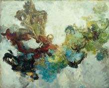 Heinz Kreutz, Barocke Erinnerung, 1955/56,
 Harzöl auf Leinwand, 98 x 121 cm,
Privatbesitz
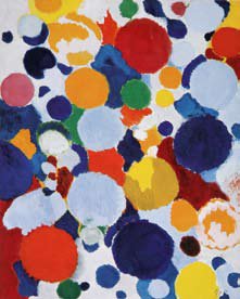 E. W. Nay, Feuerspiel, 1956,
 Öl auf Leinwand, 160 x 125 cm,
Privatbesitz
His autodidactic beginnings are from 1961 to 1963 as a student of the „Quadriga“ -artist Heinz Kreutz, Rolf Hans creates a basis for his painterly work. During this time he not only studies the tachism (French "la tache", the stain) of his mentor, but also the one of other representatives of the non-geometrical-abstract art of the Informel, which want to express emotional and spontaneous impulses through color and ductus. Hans is impressed by the abstract painting of Ernst Wilhelm Nay. Here, above all, he is attracted by the autonomously used color and the arithmetical order of the surface in front of the image, from which Nay forms his "disk images". In addition, Hans deals extensively with the expressive possibilities of Japanese calligraphy.
At the same time, Hans deals with the color theories of Johann Wolfgang von Goethe, Philipp Otto Runge - "a must for a budding painter" -, Johannes Itten and Heinz Kreutz. They form another basis for his artistic development. Looking back, he writes about this study: "Recently I found Johannes Itten's color theory, the big issue of 1961, at the flea market. As you leaf through it, you realize how much theory you want to learn and practice in order to draw from the subconscious when working. Complementary, Simultaneous Colors, Bright and Dark, Warm and Cold Color Contrasts, Quality, Quantity Contrasts. If one had to make oneself aware of these things while working, one would hardly be able to work, checking would destroy all the creativity. Back then, when the theories were learned and practiced, Itten's color theory had not yet been published; when it became available I could not afford it. Affordable sources at that time, J.W. Goethe, PH. O. Runge, the color theory of Heinz Kreutz, I copied it by hand from the original manuscript to anchor theories in the head, to try me on them."
All these inspirations are taken up by Rolf Hans and processed into unique expressive possibilities. In contrast to the works of informal painters, such as K. O. Götz or Emil Schumacher, his abstract pictures are no results of random and impulsive gestural-expressive painting actions. Rather, they are the result of a deliberate and balanced creative process in which the connection of color, shape, and line is always preserved, so that a kind of aesthetic calculability forces itself into the unconditional freedom of its approach. However, Hans does not exclude spontaneity when composing: "Nothing worse than the blank canvas on the easel. I have certain ideas to cover them with certain colors, this happens quickly and in one operation. Already with the second one, the first ideas turn out to be misconceptions, since new colors show up, which deviate mostly from the old ones. The Japanese calligraphers set black on white and divided their area. If the black shifts into the blue the demand of the opposite color already arises ... white turns yellow, other colors appear and demand new ones. It begins the color composing in forms. It's ultimately the form that enhances a picture to a work of art."
In "Blau in roter Begleitung", 1961/69, pastose stains in shades of blue, from violet to gray, bump into dark red and a few accentuating green areas. If its shape is resolved at the edge of the painting it condenses towards the middle to form solid, round shapes. Tightly crowded and overlapped, they are all subject to a suction effect that leads them inexorably to the upper third of the image, where they encounter transparent, cloud-like colored surfaces. Like the stones of a scree avalanche, the speckles seem to tumble down a cliff face, into a darkness unknown to us. It is irritating that here the 'falling down' is actually an 'ascending'. This creates the feeling that we are standing on an abyss from which we are following the seen. And the longer we do this, the more we are caught up in the cross-image appeal and carried away by it.
Quite different is the effect of "Gelb-Violett-helles Rot", 1962, which you can hardly escape. Here we meet the fire spectacle of an erupting volcano. On a dark blue ground, white, light brown and purple smoke banners spread, yellow flames blaze up, also yellow, purple and red sparks and fireballs fly towards us. Everything is blown apart into an incessant chaos that reaches far beyond the boundaries of the painting. The drama of the event is also given an impressive boost by the interaction of the colors, in particular the complimentary contrast yellow-violet.
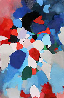 Blau in roter Begleitung, 1961/69
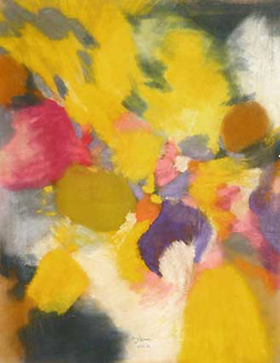 Gelb-Violett-helles Rot, 1962
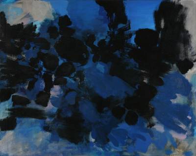 Blau-Grau-Blau, 1962
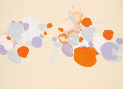 Orange-Violett, 1965
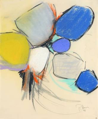 Ohne Titel (1963/1), 1963
If this pastel sparkles with irrepressible dynamism, the painting "Blau-Grau-Blau" from the same year shows us a different kind of acting. Associations to the sea may be awakened here. The composition is dominated by swath-like formations in a few shades of blue, which are interrupted in places by gray areas. As if an octopus had poured its ink, stains and lines of the deep-blue organic form in the right half of the picture are dissolving and partially penetrating the surrounding blue layers of color. Worn by the 'element water', they pull slowly, almost cumbersome, to the opposite side. The quiet movement as well as the greatly reduced range create a contemplative peace, in which we want to stay in the face of our increasingly hectic everyday life.
The smoother transcript as well as the insertion of wide or narrow line structures that the painting shows result from Rolf Hans's examination of Japanese calligraphy (see ink drawing on the right). This drawing component, which gives him a concentrated and clear painterly language, is also found in the pastel "Ohne Titel(1963/1)". The rounded patches are now bordered with black contours. Because of their partly left-over, partly blurred internal shadows, they receive an inner life, so that each form represents an individual organism. They are integrated into a spiraling rhythm, whose starting point is the bright white spot. The black line bundle and the little red flashes show the energy that emanates from him. However, the circling movement is interrupted by the tilting of the small blue spot that breaks the entire formation.
After moving from Frankfurt to Basel in 1963, Rolf Hans increasingly modified his style of composition. In the beginning there are still "Fleckenbilder", but they no longer show the seething dynamics of the previous works. Their color surfaces are more stable, the total resolution summarized, as seen in "Orange-Violett", 1965. Here, the opaque spots take on the shapes of slices that pass us. They seem to float in front of the cardboard box. Its color penetrates the spots in some areas and thus binds them to the image surface. Tension is created by the different 'distance values' of the eponymous secondary colors as well as the rubbing and overlapping of the discs, giving us the idea of a swinging motion in area and space. Not harmony, but the reconciliation of opposites is the design principle of this tempera picture.